German Short Rows (or how to avoid the wrap and turn)
We have a new video tutorial for you all. In it, I demonstrate the German Short Row method. On a personal note, I will tell you that I am thrilled to have learned this method. The wrap and turn method and I have a continuous relationship. With all the amazing patterns utilizing short rows for shaping and interesting effects, knowing different ways to accomplish the techniques.
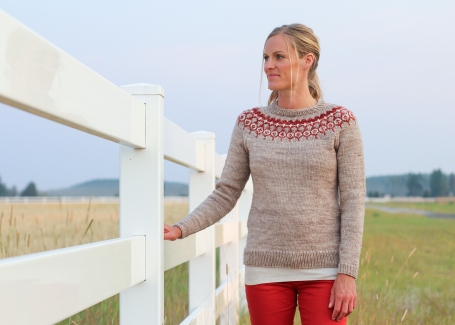
This short row method is recommended by Aimee for shaping in the No Bad Weather sweater. Short rows are used the back, shoulders and neckline.
The No Bad Weather KAL starts tomorrow. If this is the first you are hearing about the KAL, don’t worry, you have plenty of time to join us. The ending date is in November.
Read all about the KAL here. Another helpful post for the sweater is this one on choosing colors. The Ravelry thread for the KAL can be found here.
Thanks for joining us and enjoying the video. If you found it to be helpful, please give it a thumbs up.
Happy Knitting
~Angela M.
Color Choices for No Bad Weather
The most enjoyable and often most challenging portion of colorwork is making color choices. You want the color design to show. You want the colors to play nicely together and not clash. It may come down to your two favorite colors for your second contrast color. Yes, you want that sweater to be perfect. Using the New Bad Weather sweater as an example, let’s explore some ways we can use make these choices.
When making color choice for the No Bad Weather sweater, choose your main body color first. Then look for contrasting colors. Consider a color choice that pops against your main color for contrast color 1 (CC1). Contrast color (CC2) works well as a light neutral or another color that pops against both main color and CC1. When I say “pop”, I am speaking of a color that is often opposite on the color wheel from the others. Other colors that will pop are white against very dark colors or black against light colors.
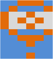
Here blue and orange are contrasting colors with the light grey as a neutral light color.
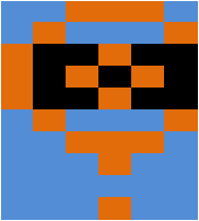
In this illustration, I replaced the light grey with black.
However, if you choose a contrast color that is too similar in color or intensity to your other, they will fade into one another. It will have a more gradient effect. While that is lovely in many projects, your colorwork “picture” will not show up especially at any amount of distance. The next illustration show how this. Walk away from your screen and you will see how the pattern because very indistinct.
However, you might want that more tonal look. I would suggest going darker with one of your colors. In the following illustration, I replaced the light blue with a blue several shades darker. If I would have chosen even lighter blue it would have blurred with the grey.
Here I reversed the two blues.
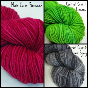
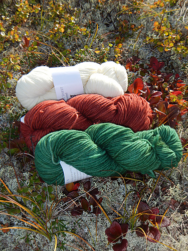
My colors of my No Bad Weather are all on different places on the color wheel. Fireweed (MC) and Limeade (CC2) are opposite one another similar to the contrast of red and green. The Scenic Byway is a dark neutral. All these colors are quite similar in saturation but their colors provide contrast.
Here is another red/orange and green color palette with a light neutral.
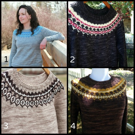
Finally, here are a few completed No Bad Weather Sweaters for inspirations. All are shown in PDS Worsted.
- Platinum (MC) with Inspiration (CC1) and Beargrass (CC2)
- Winter Raven (MC) with Beargrass (CC1) and Fireweed (CC2)
- Dusty Road (MC) with Grizzly (CC1) and Beargrass (CC2)
- Grizzly (MC) with Tupelo Honey (CC1) and Beargrass (CC2)
I hope this post helps you make color choices not only a No Bad Weather Sweater but any color work project.
I find that making collages of the colors I am considering to be a helpful tool. I often use Picmonkey for this purpose. Another way is to plug the colors into a table or spreadsheet in the color chart (see illustrations above). Of course you can go with the tried and true technique of piling your yarn choices together, stepping back and squinting. If you are making your decisions with others, ask for help. Often someone will have a good perspective.
Remember to join our No Bad Weather KAL. There are some awesome color combinations already over there. I am looking forward to even more.
Truthfully, color is my favorite way to assist people with knitting. There is so many possibilities and possibilities are what knitting (or creating in general) all about.
Happy Knitting!
~Angela M.
